Dropdown menus are a staple of modern UI design—essential for navigation, filtering, and interactive forms. With Figma’s powerful Variants, Auto Layout, and Prototyping tools, you can design fully functional dropdown components that look and behave like real menus.
In this guide, you’ll learn how to build a clean and interactive dropdown menu from scratch using Figma’s component features.
🧱 Step 1: Design the Default State
Start by creating the collapsed (default) view of your dropdown. This typically includes:
- A text label (e.g. “Select option”)
- A down-facing arrow icon
- A background container with padding
Use Auto Layout (Shift + A) to wrap the text and icon in a frame so spacing is consistent and alignment is easy to manage.
🧱 Step 2: Design the Expanded State
Next, create the open version of the dropdown. Duplicate the default frame and add a vertical list of options underneath.
Each option should be:
- A text label
- Placed inside a frame with padding and hover state (if desired)
- Aligned using Auto Layout for clean vertical stacking
Include subtle dividers or hover effects to improve readability and interactivity.
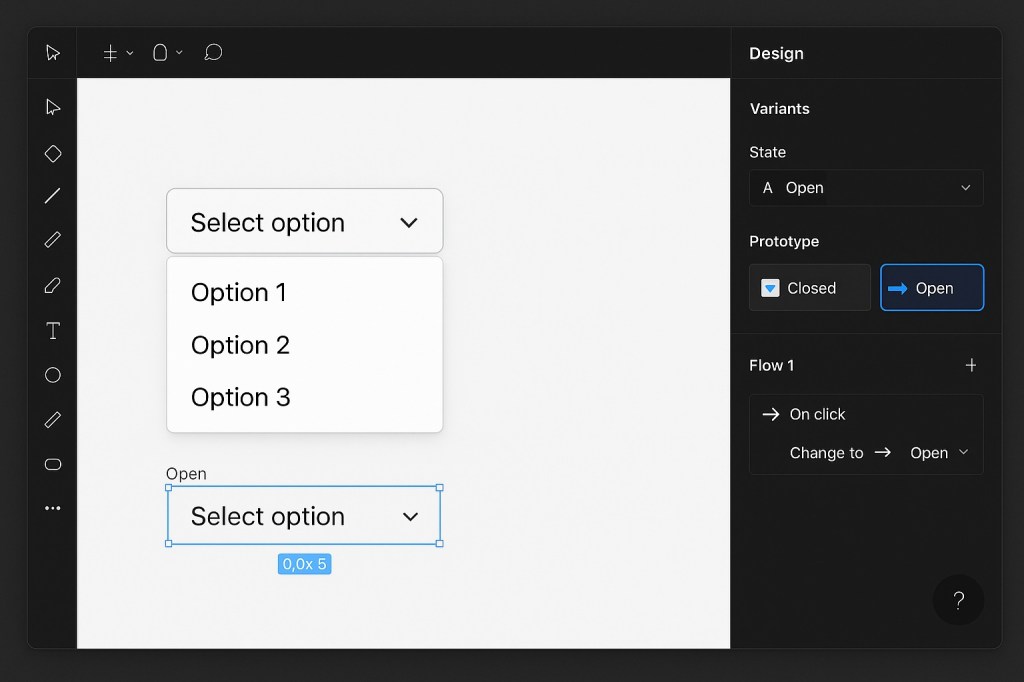
🧱 Step 3: Turn Both States into Variants
Now convert your two states (collapsed and expanded) into Variants:
- Select both frames (default and expanded).
- Click “Combine as Variants” in the right-hand panel.
- Rename the property (e.g., “State”) and label the variants “Closed” and “Open”.
This allows you to switch between states easily and set up prototype interactions.
🧱 Step 4: Add Interactions in Prototype Mode
To simulate interactivity:
- Switch to Prototype mode (
Shift + E). - Select the main button in the Closed variant.
- Drag the interaction handle to the Open variant.
- Choose On Click → Change to → Open.
Repeat the process for the Open state, linking back to Closed when the user clicks again.
Optional: Add a Smart Animate transition for a smooth dropdown effect.
🧠 Pro Tips
- Use Auto Layout padding to handle responsive text or icons inside the menu.
- Set the container’s Clip Content to hide overflowing options if the menu becomes too tall.
- Include hover states using additional variants or interactive components for a more realistic experience.
🎯 When to Use This
- Creating reusable dropdowns for design systems
- Simulating dropdown behavior in prototypes
- Demonstrating navigation, sorting, or filtering UI patterns
Final Thoughts
With Figma’s Variants and Prototype features, building dropdown menus is not only possible—it’s efficient and scalable. Once created, your dropdown can be reused across files and adapted with different states, options, or behaviors. Whether you’re designing forms, filters, or interactive menus, this method helps bring your designs closer to production reality.

 Designilo