Unlike word processors or code editors, Figma doesn’t have a built-in “text-indent” feature. So when designers need to create indented text, whether for paragraphs, lists, or visual alignment, they often wonder: How do I do this cleanly in Figma?
The good news is that you can simulate indentation using layout techniques, padding, and a few clever tricks. This article walks you through three effective ways to indent text in Figma—and when to use each one.
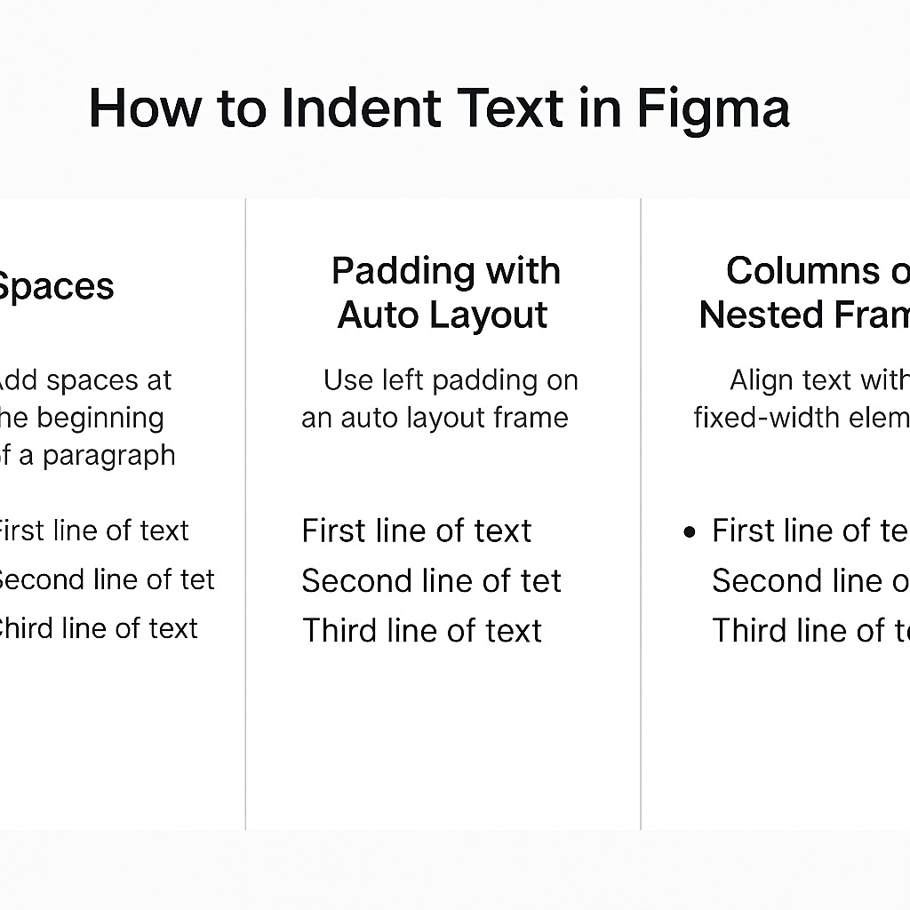
🛠️ Method 1: Use Spaces or Non-breaking Spaces
The quickest way to create an indent is by adding spaces at the beginning of a paragraph.
How to do it:
- Place your text in a normal text box.
- At the start of the paragraph, add spaces using the spacebar (
␣) or copy-paste a non-breaking space (⌥ + Spaceon Mac). - You can control the number of spaces for consistency.
✅ Best for: Quick mockups, one-off text adjustments, or paragraph-first line indents.
Limitations: This method isn’t scalable or consistent across devices and screen sizes—it’s more visual than structural.
📏 Method 2: Use Padding with Auto Layout
If your text block is part of an Auto Layout frame, you can simulate indentation by using left padding.
How to do it:
- Place your text inside a frame (
Frame → Auto Layout → Vertical). - Apply left padding (e.g., 16px or 24px) to the frame.
- If needed, keep the top padding low to maintain tight vertical spacing.
✅ Best for: UI design, components, form labels, or responsive layouts.
This approach ensures consistency and scales well with dynamic content.
📐 Method 3: Use Columns or Nested Frames for Lists
If you’re working with bullet points or multi-line lists, consider nesting each line of text in a horizontal Auto Layout frame with a fixed-width element (like an empty spacer or bullet symbol) on the left.
How to do it:
- Create a new horizontal frame.
- Add a small frame or icon to the left (e.g., a 16px-wide empty rectangle or bullet).
- Place your text layer next to it.
- Set spacing and alignment so it reads like an indented block.
✅ Best for: Lists, structured content, and repeated elements in a design system.
This gives you fine-grained control over alignment, especially when used with components or variable text.
💡 Bonus Tip: Use Grids or Guides
For pixel-perfect indentation, turn on layout grids or rulers (Shift + R) and align your text layers to consistent vertical lines. This ensures visual alignment without relying on manual nudging.
✅ Final Thoughts
Figma might not have a built-in “indent” button—but with a few layout tricks, you can achieve the same results cleanly and consistently. Whether you’re working on UI components or designing long-form content, Auto Layout and padding are your best tools for creating reliable indents in your designs.

