Managing multiple brands inside one design system used to be messy. Duplicated files, separate libraries, constant updates. But with Figma Variables and Modes, you can now handle light/dark themes, brand palettes, spacing systems—and even full UI kits—without duplicating a single component.
Let’s break down how to build smart, scalable, multi-brand systems using variables + modes in Figma.
🧠 What Are Variables in Figma?
Variables in Figma let you store reusable design values like:
- Colors (e.g.
color-bg-primary) - Text styles (via tokens)
- Spacing units (
spacing-8,padding-lg) - Boolean values (e.g.
is-focused) - Strings (e.g.
button-label)
Instead of hardcoding styles or dimensions, you can reference variables directly—just like in CSS.
🎛️ What Are Modes?
Modes are sets of values attached to the same variable. For example:
color-bg-primarymight be:- Blue in “Brand A”
- Green in “Brand B”
- Black in “Dark Mode”
This means you can:
- Switch between themes or brands
- Keep one component library
- Preview the UI in different modes instantly
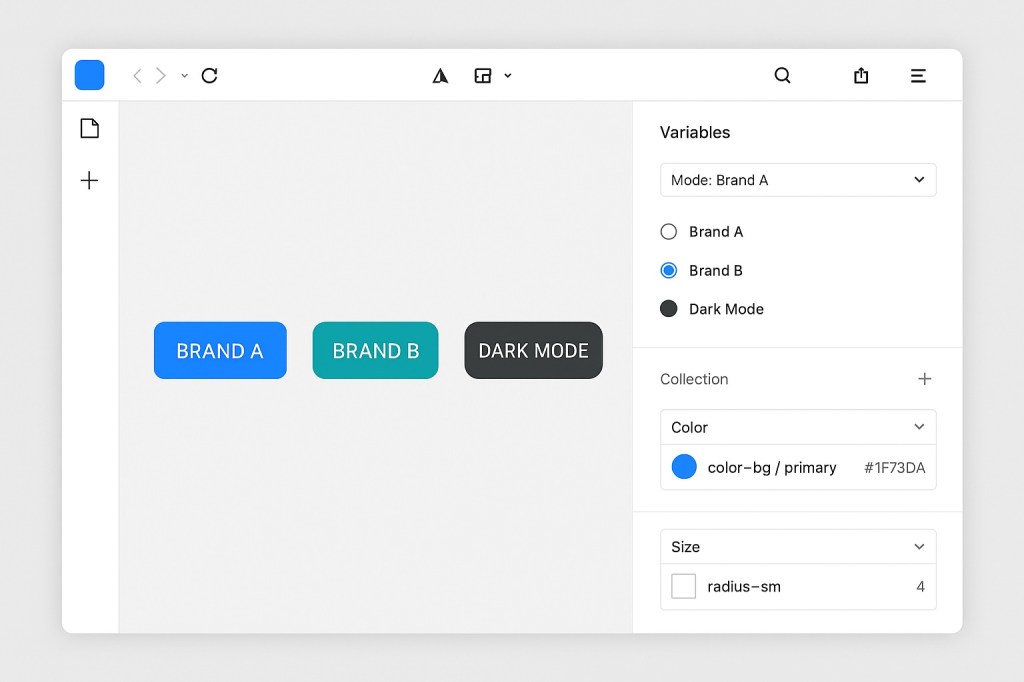
🧩 Use Case: A Multi-Brand Button
Let’s say you have a primary button. Instead of creating:
- Button-A
- Button-B
- Button-Dark
You create one component that uses:
color-bg-primaryradius-mdfont-body-sm
And define those variables differently in each mode:
- Brand A mode: blue background, 4px radius
- Brand B mode: teal background, 8px radius
- Dark Mode: gray background, white text
You now have one button, infinite variations—powered by tokens.
💡 Why This Matters
Without variables:
- Each brand = duplicated file
- Each theme = extra maintenance
- Tokens = hard to track
With variables:
- One source of truth
- Easy to update across systems
- Instant theme switch for dev previews
- Easier integration with Dev Mode + code handoff
🛠️ How to Set It Up
- Create a Variable Collection
- Use Figma’s Variables panel
- Define your color, spacing, and text values
- Add Modes
- Create a mode for each brand/theme
- Assign different values for each
- Use Variables in Components
- Apply to fills, borders, text, padding, etc.
- Use variables inside nested styles too
- Switch Modes to Preview
- From the top toolbar, toggle between modes
- Your UI adapts instantly
🧠 Best Practices for Multi-Brand Systems
| Tip | Why It Matters |
|---|---|
Use semantic tokens (e.g. color-text-primary) | Abstracts the usage from the value |
| Group modes by theme, not project | Makes scaling easier |
| Don’t mix brand + theme in one mode | Keep branding and theming cleanly separated |
| Use dev-friendly names | Easier to sync with code |
🤝 Variables + Dev Mode = Dream Handoff
When you use variables and modes, Dev Mode will:
- Show exactly which token is applied
- Let devs toggle between themes
- Simplify integration with design tokens in code
🔮 Final Thoughts: Build Once, Theme Forever
Figma Variables + Modes unlock a modern, scalable design system. Whether you’re managing white-label apps, product themes, or regional branding, you can do it all from one system—without duplicating components or breaking consistency.
Tokens are no longer a nice-to-have. They’re the foundation.

 Designilo