Navigation is the backbone of any digital interface. Whether you’re designing a mobile app, website, or dashboard, clear and functional navigation helps users get where they need to go.
In Figma, you can design, prototype, and simulate real navigation interactions—all without writing a single line of code.
In this guide, you’ll learn:
- How to design navigation bars and menus
- How to make them interactive using Figma’s prototyping tools
- How to simulate page transitions, hover effects, and flows
- Pro tips for scalable and responsive nav systems
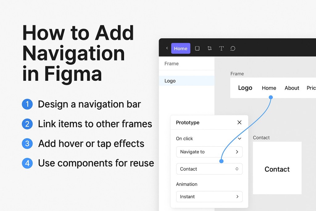
🧭 1. Design the Navigation Bar or Menu
Start by laying out your visual structure.
For Web/Desktop:
- A top navbar with logo, links, and buttons
- Sticky header option (frame pinned to top)
For Mobile:
- A bottom tab bar with 3–5 icons
- Optional side drawer (hamburger menu)
Use auto layout and consistent spacing to keep things aligned and responsive.
💡 Group elements into a Frame, and apply padding/margins for scalability.
🔗 2. Make Navigation Interactive (Using Prototypes)
Figma’s Prototype tab lets you link buttons, icons, or text to other frames to simulate navigation.
To add links between pages:
- Select a button, icon, or text layer
- Click the Prototype tab in the right panel
- Drag the blue “+” node to the destination frame
- Choose an interaction (e.g., “On click → Navigate to”)
- Select the transition style:
- Instant
- Smart Animate
- Slide in/out
- Dissolve
Repeat for each link in your navbar or menu.
🖱️ 3. Add Hover or Tap Effects (Optional)
To create more realistic nav interactions, use variants and component states:
- Create a nav item (text or icon)
- Add a hover state using Variants (change color, underline, icon fill)
- Use “While hovering” as the trigger in the Prototype panel
- Use “On tap” for mobile-style touch interactions
This makes your prototype feel much more interactive—great for demos and user testing.
🧩 4. Use Components for Scalable Navigation
Make your nav system reusable with main components:
- Turn navbars, tabs, and drawers into components
- Use nested components for nav items
- Add Variants for active/inactive states
- Use Auto Layout so they resize properly on different screens
This speeds up your workflow and helps when you want to update nav globally.
📱 5. Simulate Responsive Navigation
You can simulate breakpoints or different layouts using separate frames:
- Create one frame for desktop nav
- One for tablet (condensed)
- One for mobile (hamburger menu)
Then use Prototype links or Variables (Modes) to swap between them in presentation mode.
🔄 Use a top-level frame with auto layout + sticky header for scroll behavior.
🧰 Bonus: Use Plugins for Navigation UI
Want quick UI elements?
Try these:
- “Untitled UI” – component library with navbars and tabs
- “TopNav” or “NavBar Kit” – prebuilt nav templates
- “Iconify” – grab nav icons (menu, arrow, home, etc.)
🚫 What Not to Do
- ❌ Don’t manually copy-paste nav across pages—use components
- ❌ Don’t hardcode links—use prototype connections for interactivity
- ❌ Don’t overcomplicate nav for small screens—simplify
✅ In Summary: Adding Navigation in Figma
| Task | Best Practice |
|---|---|
| Design nav UI | Use Frames + Auto Layout |
| Make clickable links | Prototype → Navigate to Frame |
| Add hover/tap states | Variants + “While Hovering” |
| Reuse across pages | Components + Variants |
| Simulate breakpoints | Separate Frames or Modes |
Navigation in Figma isn’t just visual—it’s functional. By combining layout tools, components, and prototyping, you can design fully interactive navigation systems that look great and behave like the real thing.
For more Figma tips, prototyping hacks, and design system guides, visit Designilo.com.

 Designilo