Creating clean, scalable components in Figma isn’t just about visuals—it’s about behavior. Whether it’s toggling a switch, expanding a menu, or highlighting a selected tab, components often need to represent multiple states. Figma’s variables and boolean logic make this not only possible—but refreshingly easy.
In this article, we’ll walk through how to build multistate components using variables, boolean toggles, and variants—with examples you can apply to real-world design systems.
🔄 What Are Multistate Components?
A multistate component is a design element that can appear in different configurations or states, such as:
- ✅ On / Off
- 🟡 Hover / Pressed / Disabled
- 📂 Expanded / Collapsed
- 🔘 Selected / Unselected
Managing all of these states manually becomes a nightmare. That’s where Figma variables + boolean logic step in.
🧠 Why Use Variables and Boolean Logic?
Using variables to control component states gives you:
- Cleaner file structures: Avoid endless variant combinations
- Dynamic previews: Change states instantly with variables
- Improved collaboration: Developers understand the logic behind the states
- Token alignment: Sync behavior with your design system
🧰 Key Concepts to Know
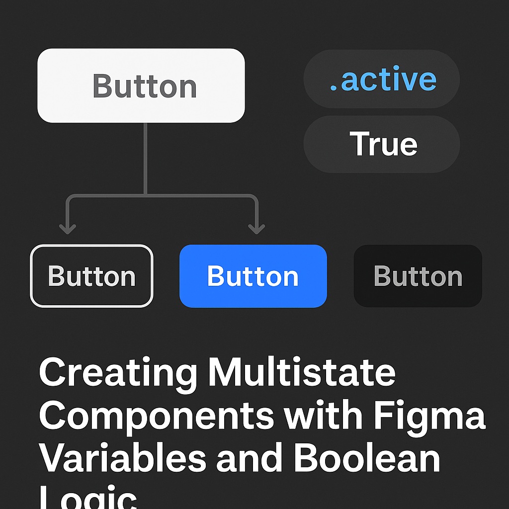
1. Boolean Variables
These store true/false values. In Figma, you can create booleans like isSelected, isHovered, or menuOpen.
2. Variant Properties
Variants are different visual states. Combine with boolean variables to switch between them.
3. Variable Mode Previews
Use variable modes to preview how a component looks under different settings (great for QA or dev handoff).
🔨 Building Your First Boolean-Controlled Component
Let’s say we’re designing a toggle switch with two states: On and Off.
Step 1: Create Your Base Variants
- Duplicate your toggle shape.
- Style one as “On” and the other as “Off.”
- Create a component with two variants:
state=onstate=off
Step 2: Add a Boolean Variable
- Go to the Variables panel.
- Create a variable:
toggleOn(type: boolean)
Step 3: Bind the Variable to the Component
- Use “Set to Variable” in the property settings.
- Link the
toggleOnvariable to yourstateproperty.
Now you can control the toggle with a true/false switch.
🧩 Complex Example: Tabs Component
Want to highlight the active tab based on a variable? Here’s how:
- Create a Tabs component with 3 variants:
selectedTab=tab1selectedTab=tab2selectedTab=tab3
- Add a Text variable or string token called
selectedTab. - Bind that variable to the component. Now, updating the variable updates the active tab.
🧪 Prototyping With Variables
You can use interactions and conditional logic in Figma’s Prototyping tab to:
- Toggle a boolean on click
- Switch tabs
- Trigger menu dropdowns
Example:
Clicking a menu icon sets menuOpen = true, revealing the dropdown.
No need for multiple frames. You’re building logic-driven UI, just like in code.
🎯 Benefits for Developers
This structure mirrors real frontend logic:
- Boolean variables =
if/else - Variant props = component props
- Variable previews = UI test states
This makes dev handoff more intuitive and implementation more predictable.
📋 Best Practices
- ✅ Name your variables clearly:
isDisabled,menuExpanded - ✅ Keep variable scopes organized (e.g., global vs local)
- ✅ Use combined booleans sparingly—prefer variant groups when it gets complex
- ✅ Document how variables affect states for devs
🔄 Real-World Examples to Try
| Component | Variables Used |
|---|---|
| Button (Hover + Disabled) | isHovered, isDisabled |
| Accordion Menu | isExpanded |
| Toggle Switch | isOn |
| Modal Dialog | isOpen, hasOverlay |
| Tab Group | activeTab (string) |
🧭 Wrapping Up
Multistate components don’t have to mean a bloated mess of variants. By introducing boolean logic and variables, you give your Figma files:
- More flexibility
- Better dev alignment
- Less redundancy
- And cleaner logic-driven design
You’re not just designing visuals—you’re designing systems that think.
➡️ Next up: “Token-First Design: Why Your Next Component Should Start with a Variable”

 Designilo