Hamburger menus are the go-to navigation pattern for mobile and small-screen interfaces. They save space and offer users access to key sections without cluttering the UI. But in Figma, building a hamburger menu that actually works in a prototype requires more than just stacking three lines.
In this guide, you’ll learn:
- How to design the hamburger icon
- How to build the slide-in menu panel
- How to wire it up for interaction using components and prototyping
- Bonus: Animate open/close transitions for polish
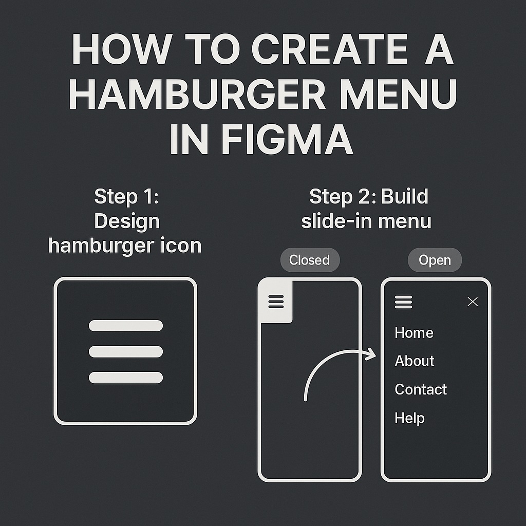
🍔 Step 1: Design the Hamburger Icon
The hamburger icon is simply three stacked horizontal bars.
How to make it:
- Use the Rectangle Tool (R) to draw a small bar (e.g., 24×2 px)
- Duplicate it twice (Cmd/Ctrl + D)
- Stack them vertically with 4–6 px spacing
- Group them (Cmd/Ctrl + G) or frame them
- Optional: Turn into a Component and label it “Hamburger Icon”
🎯 Tip: Add a hover state using variants if you want it to highlight on tap.
📋 Step 2: Build the Slide-In Menu
This is the panel that shows when users tap the hamburger icon.
How to build it:
- Create a Frame (e.g., 300xFull Height for mobile, aligned to the left or right edge)
- Add navigation items as text or buttons
- Use Auto Layout for vertical spacing and padding
- Add a background color, shadow, or blur for contrast
- Turn this menu panel into a Component
You can create two Variants:
- One:
Closed(opacity 0 or off-screen) - Two:
Open(visible and in place)
🧠 Step 3: Combine Icon + Menu into a Parent Component
- Create a new Frame for the full nav setup
- Place the hamburger icon and the menu panel inside
- Use Variants:
- Variant 1: Menu hidden
- Variant 2: Menu shown
- Add Component Properties:
- Boolean:
Menu Opentrue/false - Instance Swap (if you want to switch icons to a close/X icon)
- Boolean:
🔗 Step 4: Add Prototype Interactions
- Go to the Prototype tab
- On the hamburger icon, drag the blue circle to the other variant (Menu Open)
- Set interaction to:
On Click → Change to → Open - Add a reverse interaction from the menu’s close icon or background:
Change to → Closed
💡 Use transitions like “Move In,” “Smart Animate,” or “Slide In” for smooth effects.
🎨 Optional: Animate Menu Icon to X
To elevate the UX:
- Create a second variant of the hamburger icon showing an “X”
- Use Smart Animate between states
- Trigger the icon change when the menu opens/closes
🧩 Step 5: Save as a Reusable Component
Wrap your full nav into a master component:
- Mobile header with hamburger
- Slide-in menu with nav links
- Sticky behavior if needed
Now you can drop it into any screen in your mobile UI.
✅ Summary: Creating a Hamburger Menu in Figma
| Task | Tool |
|---|---|
| Draw hamburger icon | Rectangle tool + Auto Layout |
| Design nav panel | Frame + Auto Layout |
| Add interactivity | Variants + Boolean props |
| Trigger open/close | Prototype tab → “Change to” |
| Animate it | Smart Animate or Slide transitions |
With this setup, your Figma prototype will feel just like a real mobile app. Clients and developers will get a true sense of how the navigation works, and you can reuse your nav setup across multiple pages and projects.
Want more interactive design tutorials like this? Explore the full UI design workflow series at Designilo.com.

 Designilo