Text overlays are everywhere in UI and graphic design — from hero banners on websites to labels on product cards. In Figma, creating clean, readable text overlays is simple once you understand layers, contrast, and positioning.
In this step-by-step guide, you’ll learn:
- What a text overlay is and when to use one
- How to place text over images
- How to make overlays readable (darken, blur, gradient, etc.)
- Best practices for visual hierarchy and responsiveness
🧠 What Is a Text Overlay?
A text overlay is when you place text on top of another element — typically an image or a video — and make sure it remains visible and legible.
You’ve seen it in:
- Full-width website headers
- Product cards with price labels
- Blog preview images with titles
- Call-to-action buttons layered over photos
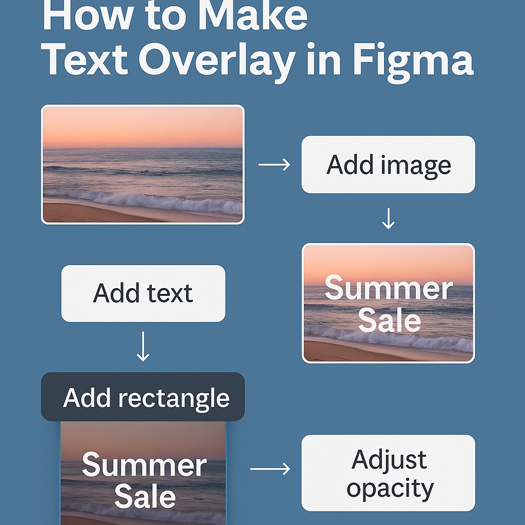
🧱 Step-by-Step: How to Make a Text Overlay in Figma
✅ Step 1: Add Your Image
- Drag and drop an image onto the canvas or use Fill → Image
- Place the image inside a Frame if you’re building a UI card or banner
Tip: Use Auto Layout for containers if you want responsiveness.
📝 Step 2: Add the Text Element
- Use the Text Tool (T) to type your text (e.g., “Summer Sale” or “Welcome to our app”)
- Set the font size, weight, color, and alignment
- Position it above the image in the layer stack
🔁 You can center-align it horizontally, vertically, or align it to corners depending on your layout.
🌗 Step 3: Ensure Readability with Overlay Techniques
Here are 4 ways to ensure your text remains legible on busy or bright images:
1. Add a Semi-Transparent Overlay
- Draw a rectangle over the image
- Fill it with black or white at 20–50% opacity
- Place the text above the rectangle
2. Apply a Blur Layer
- Same rectangle → Add a Background Blur effect (e.g., 10px)
- Keeps image visible while boosting contrast
3. Use Gradient Overlays
- Add a linear gradient from black to transparent
- Often used on bottom edges of hero images
- Position text in the darkest part for max contrast
4. Add a Text Shadow
- Select the text → Effects → Drop Shadow
- Use subtle shadows to make text pop
🎨 Optional Styling Tips
- Match overlay color with your brand palette
- Use large headings + bold weights for impact
- Combine with icons or buttons (e.g., “Read More” CTA)
🧩 Bonus: Use Auto Layout for Responsive Overlays
If your overlay is inside a card, use Auto Layout:
- Wrap image, overlay, and text in a frame
- Set Auto Layout → Vertical
- Use Absolute Positioning for the text layer if needed
- Combine with constraints (e.g., center or bottom aligned)
🚫 What Not to Do
| Mistake | Fix |
|---|---|
| Text disappears on image | Add overlay or shadow |
| Text too close to edges | Use padding or alignment constraints |
| Overlays too dark or light | Test with different images |
| Unreadable fonts | Use strong sans-serif typefaces with high contrast |
✅ Summary: How to Make Text Overlay in Figma
| Task | Tool |
|---|---|
| Add image | Fill or drag into frame |
| Add text on top | Text Tool (T), then layer above |
| Add readability layer | Rectangle with opacity or blur |
| Style it | Gradients, shadows, or large font |
| Make responsive | Auto Layout + constraints |
Text overlays help bridge the gap between visuals and messaging — drawing users in with engaging imagery while communicating core content. With a few layering tricks and styling choices, you can build overlays that are clear, elegant, and on-brand.
Want to go further with responsive banners, UI kits, and text-on-image components? Explore all Figma workflow guides on Designilo.com.

 Designilo