In Figma, the term “material” isn’t a native feature like it is in platforms such as Google’s Material Design or 3D design tools like Blender. However, in a UI/UX context, creating a new “material” in Figma typically refers to designing a reusable visual element—such as a button, card, or surface—with defined styles, shadows, elevation, and interactions that align with material design principles.
In this article, we’ll guide you through how to create a new material-style component in Figma and turn it into a reusable asset for your design system.
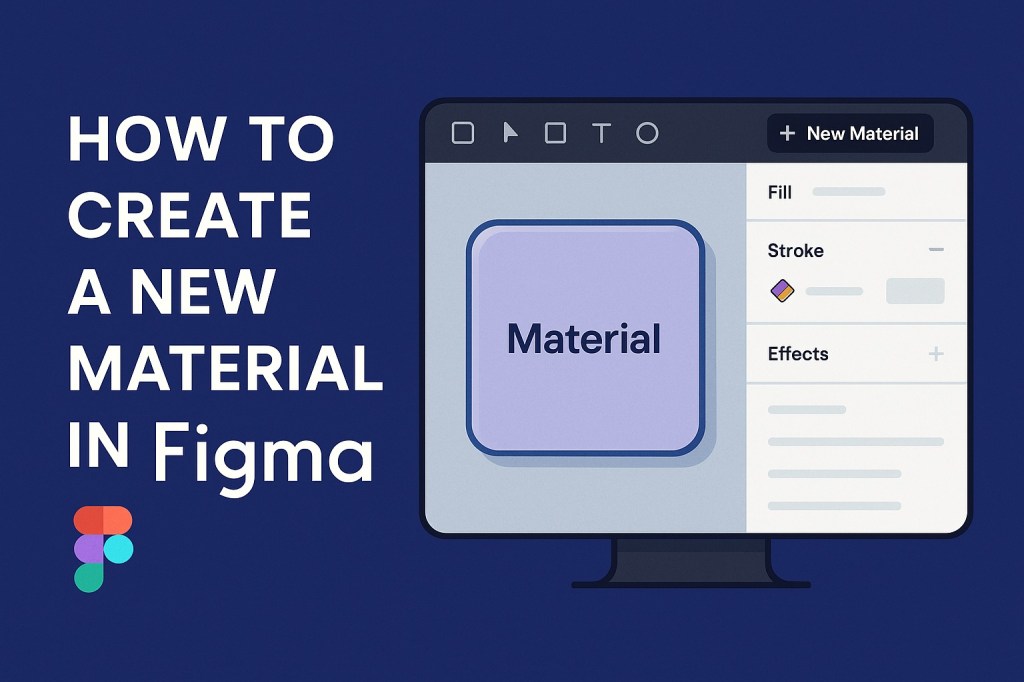
🧱 What Is a “Material” in Figma?
In UI design, a material is a building block—a visual component that reflects depth, lighting, and structure. Think of:
- Buttons with elevation and shadows
- Cards with layered hierarchy
- Surfaces that reflect depth and motion
In Figma, these are created using frames, fills, effects, variables, and components.
🛠️ How to Create a New Material in Figma
✅ Step 1: Set Up Your Frame
- Press F to create a new frame.
- Choose a size that fits the purpose—e.g., 240×160 for a card, or 56×56 for a FAB.
✅ Step 2: Apply Fill and Color Variables
- Click the frame and go to the right-hand Fill panel.
- Select a color or use a predefined color variable (if you’re using design tokens).
✅ Step 3: Add Shadows for Elevation
- Under Effects, add a Drop Shadow.
- Customize the
Y offset,blur, andopacityto reflect proper material elevation (e.g., use 0, 4, 6 for a medium card).
✅ Step 4: Add Borders and Corners
- Use a subtle border for visual separation if needed.
- Adjust corner radius for softness—often 4px, 8px, or even 24px depending on the system.
✅ Step 5: Embed Content
- Add text, icons, or other components inside the frame.
- Use Auto Layout (Shift + A) for spacing consistency and alignment.
✅ Step 6: Turn It into a Component
- Select the entire frame and hit Ctrl/Cmd + Alt + K to create a Component.
- Name it clearly, e.g.,
Material/Card/BaseorMaterial/Button/Filled.
🎨 Optional: Use Variables for Theming
Want your material to adapt across light and dark themes? Assign variables to:
- Fill color
- Text color
- Stroke color
- Elevation (using multiple shadows as modes)
This makes your material more flexible and consistent across themes.
💡 Tips for Better Material Design in Figma
- Use Material Design Guidelines from Google as a reference.
- Stick to spacing and typography scales for visual harmony.
- Create variants of your material (e.g., elevated, pressed, disabled) for interactions.
- Document your materials clearly inside your Figma library for team use.
🧩 Summary
While Figma doesn’t have a literal “material” object, it offers all the tools you need to create materials inspired by Material Design or your own visual system. By combining frames, effects, variables, and components, you can craft beautifully reusable, themable, and scalable design materials.

 Designilo